
So far, you’ve had the pleasure of learning about LESS. I’m going to build a simple responsive site, mixing old and new techniques, with LESS simplifying my styles a bit.
Before we go any further, a quick note on browser support: We’ll build this to work with (almost) native support. I’ll note what each shim does as we get to them to get support for extra features and making the media queries work in older brasiers.
One, Two, Three Columns
This choice of layout should suit visitors from mobiles, tablets, net-books, laptops, desktops and full-screen 27″ iMacs. We’ll have one column that’s full width from 0px up to 600px, two columns that fluidly fit between 600px and 1000px and then three columns that fluidly fit between 1000px and 1400px. Responsive web design isn’t just about making it work on small screens; large screens are equally important.
The way we’ll format our CSS is by setting all your typography, colours, spacing and the like outside of media queries. Anything that has a float, position or any other positional property will go inside a media query. I like to do it this way. Separation is always good.
The Theory
So, let’s jump right in. We have 2 main boxes, one article and one aside. The article will always appear to be about half the width when the sidebar is shown and the sidebar will split into two columns on the largest of our media queries. On screens less than 600px (most mobile devices), we’ll have one column with the aside pushed to the bottom.
To achieve this, we’ve used percentages to set a width on the article and aside and floated them too. Using a LESS mixing, .clearfix(), the body tag gets the correct height.
Shims
In this design, we won’t need any shims. More complex sites have videos and need to support old browsers though. Modern browsers cope very well with fluid layouts. But, when it comes to rich media (Flash videos, mostly) the browser needs a little help to keep things in good shape. Older, less capable browsers need some help recognising media queries too. So what shims should you use to fix those two main issues?
The fickle bastard that is IE (as well as other browsers) sometimes always have trouble recognising CSS media queries. This script fixes that, though there’s sometimes a short flash of un-styled page before the JS kicks in and saves our asses. Note that so long as you only have positional stuff in the media queries, the IE < 9 users will still see the correct fonts, colours, sizes, background etc etc.
This is a nice little jQuery script that resizes videos, whilst keeping there original ratio. Even modern browsers need this. It works with most major video hosts like YouTube and Vimeo.
The Good Stuff – The Code
HTML first
<!DOCTYPE html>
<html>
<head>
<title>Responsive Website</title>
<meta charset="utf-8">
<meta name="viewport" content="user-scalable=yes, width=device-width" />
<link rel="stylesheet" href="styles/css/styles.css" />
</head>
<body>

<div id="width">

</div>

<article>
<h1>Hello World</h1>
<p>Lorem ipsum dolor sit amet, consectetuer adipiscing elit, sed diam nonummy nibh euismod tincidunt ut laoreet dolore magna aliquam erat volutpat. Ut wisi enim ad minim veniam, quis nostrud exerci tation ullamcorper suscipit lobortis nisl ut aliquip ex ea commodo consequat.</p>
<img src="https://placekitten.com/800/500">
<p>Lorem ipsum dolor sit amet, consectetuer adipiscing elit, sed diam nonummy nibh euismod tincidunt ut laoreet dolore magna aliquam erat volutpat. Ut wisi enim ad minim veniam, quis nostrud exerci tation ullamcorper suscipit lobortis nisl ut aliquip ex ea commodo consequat. Lorem ipsum dolor sit amet, consectetuer adipiscing elit, sed diam nonummy nibh euismod tincidunt ut laoreet dolore magna aliquam erat volutpat. Ut wisi enim ad minim veniam, quis nostrud exerci tation ullamcorper suscipit lobortis nisl ut aliquip ex ea commodo consequat.</p>
<p>Lorem ipsum dolor sit amet, consectetuer adipiscing elit, sed diam nonummy nibh euismod tincidunt ut laoreet dolore magna aliquam erat volutpat. Ut wisi enim ad minim veniam, quis nostrud exerci tation ullamcorper suscipit lobortis nisl ut aliquip ex ea commodo consequat.</p>
</article><!-- end .main-content -->

<aside>

<div class="widget">
<div class="inner">
<h3>Lorem Ipsum</h3>
<p>Lorem ipsum dolor sit amet, consectetuer adipiscing elit, sed diam nonummy nibh euismod tincidunt ut</p>
</div>
</div>

<div class="widget">
<div class="inner">
<h3>Dolor Simet</h3>
<ul>
<li>Lists are some damn cool</li>
<li>Though this isn't really a list</li>
<li>More a collection of words to fill space</li>
</ul>
</div>
</div>

<div class="widget">
<div class="inner">
<h3>Sed Diam</h3>
<img src="https://placekitten.com/400/250">
<p>Lorem ipsum dolor sit amet, consectetuer adipiscing elit, sed diam nonummy nibh euismod tincidunt ut</p>
</div>
</div>

</aside><!-- end .sidebar -->

</body>
</html>
And then the CSS LESS
Note that this LESS is compiled locally into a .css file which is then referenced in the head of our HTML
/*****
MIXINS
*****/
.clearfix {
zoom: 1;
&:after {
display: block;
visibility: hidden;
height: 0;
clear: both;
content: ".";
}
}

/*****
CRAPPY, FAST RESET
*****/
* {
padding: 0;
margin: 0;
}
article, aside {
display: block;
}


/*****
BASIC TYPOGRAPHY
*****/
body {
font-family: Helvetica, Arial, sans-serif;
font-size: 13px;
line-height: 20px;
.clearfix;
}

h1 {
margin-bottom: 20px;
font-size: 30px;
line-height: 30px;
}

p {
margin-bottom: 20px;
}

ul {
padding: 0 0 0 10px;
li {
list-style-position: inside;
}
}

.widget {
background: rgba(0,0,0,0.2);
& > * {
margin: 10px;
}
}

img {
max-width: 100%;
}


/*****
0px 600px MQ
*****/
@media screen and (max-width: 600px) {

body {
max-width: 600px;
margin: 0 auto;
padding: 20px;
background: #fff;
}

}


/*****
601px 1000px MQ
*****/
@media screen and (min-width: 601px) and (max-width: 1100px) {

body {
max-width: 1000px;
margin: 0 auto;
padding: 20px;
background: #eee;
}

article {
width: 65%;
float: left;
}

aside {
max-width: 30%;
float: right;
}

}


/*****
1001px 1600px MQ
*****/
@media screen and (min-width: 1101px) {

body {
max-width: 1400px;
margin: 0 auto;
padding: 20px;
background: #ddd;
}

article {
max-width: 50%;
float: left;
}

aside {
background: rgba(0,0,0,0.1);
max-width: 45%;
float: right;
padding: 0 20px 20px 20px;
.widget {
width: 48%;
margin-top: 20px;
&:nth-child(odd) {
float: left;
clear: left;
}
&:nth-child(even) {
float: right;
clear: right;
}
}
}

}
How It Works
I’ll try to explain this as briefly, if only to dispel the myth that responsive web deign is hard.
When the page is loaded or resized, it looks at the CSS and shows all the CSS, except that which is inside a media query that doesn’t match the current state of the browser. So, if your browser is say 1200px wide, you’ll see the styles that are inside the 1001px 1600px query. If you resize down to 400px, you’ll get the styles inside the 0px 600px query.
Some clever stuff happens to images and videos that resize them to fit inside the container whilst maintaining the a sect ratio. You’ve got to know that the fluid images technique shown here doesn’t work if your images have width and height attributes declared.
How’s it look?
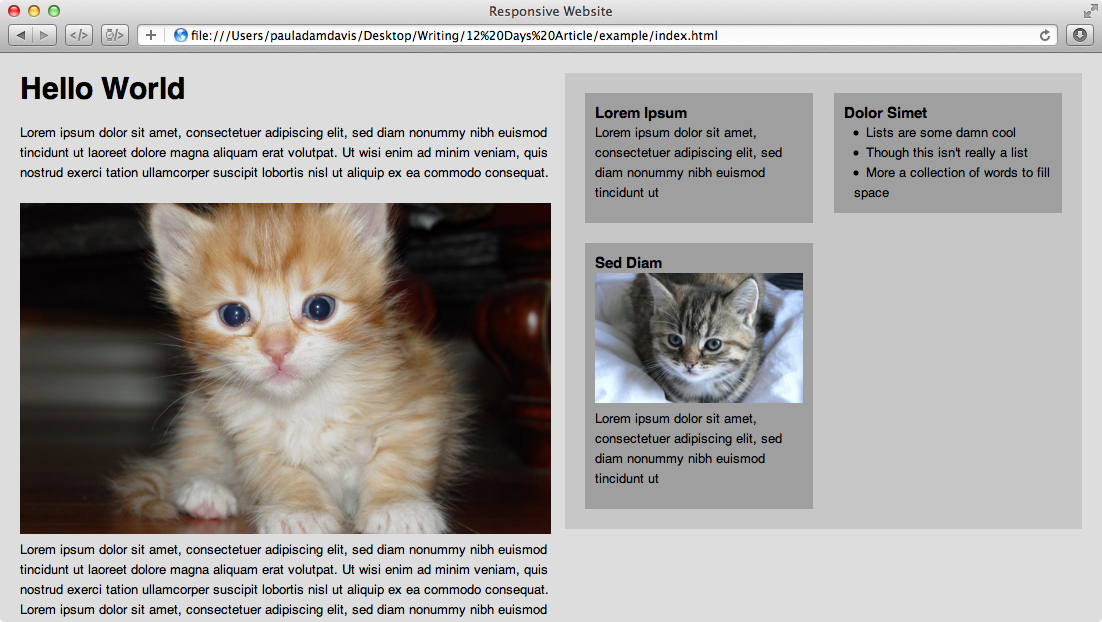
The proof is in the warm, tasty christmas pudding (with brand butter I hope). Here’s how the exact code above looks in different sized viewports. Check the demo.
Tiny
Small
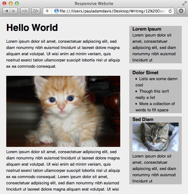
Medium
Large
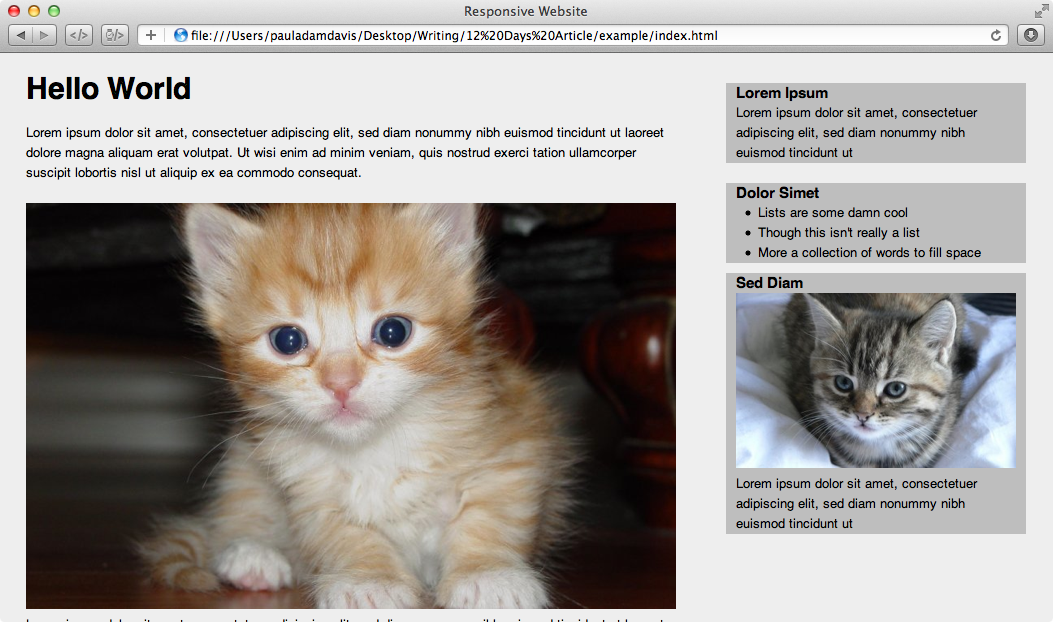
Huge
Considerations
I have intentionally left real responsive images (via client side or service side wizardry) out, it’s beyond the scope and still open to debate. I mean, there were two 24 Ways articles as it is. I have also been very simple with my CSS, thins can get tricker when you start adding more boxes & stuff, but the theory is the same, the bugs are not. You’re no idiot, you’ll work it out. :)
I could also have used a relative font-size unit rather than pixels, but everyone knows pixels. I prefer pixels anyway.
In closing
This is one of many ways to skin the proverbial cat that is responsive design (pun totally intended). There’s many other ways that are more responsive than this, but this is certainly a step in the right direction. The example was based on what seems to be a common layout, but with responsive styles added in, in hope that you see a way to make existing sites work better on other devices.
I hope you liked this little article and exploration into semi-fluid layouts. Let us know your thoughts in the comments.