
I’d like to start off by asking what seems like quite a simple question: What is the difference between data and information? And taking it a step further, where does knowledge fit into this definition? Not as easy to answer as you might expect, is it! Before we start getting our hands dirty creating some awesome data visualisations, it’s going to be useful to learn the definitions of – and difference between – these three words.
Data is a set of unprocessed facts (the word comes from the latin datum which means “that which is given”). These data are generally meaningless until they have been processed. This could be a list of a population’s height, eye colour, skin tone, handedness, etc.
Information is what you get after you’ve processed the data. This is much more useful and easy to process than data for humans. Continuing with the census theme, information includes the average height of different countries, that 1 in 10 people are left handed, and that Scandanavians tend to burn more easily in the sun.
Knowledge is perhaps the most difficult to define, but the definition which I think makes most sense in this instance is how we use our past experiences to decide what to do based on information. If we know that we have a lighter skin tone, we go out and buy a higher SPF sun block before summer holidays.
If we think about the weather (considering I’m English, it’d be rude not to mention it at least once), the data is the set of measurements recorded by the Met Office (temperature, pressure, satellite images of the clouds, etc), the information is the forecast which they produce (this is, the processed facts), and the knowledge is what you choose to do based on the information (i.e. wear shorts or take your umbrella out with you).
Now that you know what data, information and knowledge are, you should be able to see that the purpose of data visualisation (or data-vis as the cool kids call it) is to take data and turn it into a more meaningful form – information. People can then use this information along with their knowledge to make decisions or draw conclusions. I’m sure that you see examples of this almost every day in the form of infographics, but data-vis is not limited to static graphics—some of the best visualisations I’ve seen are animated to show how trends change over time. It turns out that sometimes it is useful to play around with your data to find trends before even thinking about the design of your infographics or charts. It can be used as a tool as well as an end result.
So what are we going to build, and what with?
I’ll show you how to build a relatively simple interactive chart which will display various stats on roller coasters (those of you who know me will be rolling their eyes right now). It will be like one of those scatter graphs which you had to draw in maths at school with an X and a Y axis, but instead of using an ‘x’ or a dot for each point, I’ll use a circle which will change in size to allow for a third dimension. And just to show off, I’ll also colour the circles differently to indicate what kind of roller coaster it represents. A simple chart which can display four pieces of data per point. Pretty nifty, huh?
It’s important to have a good dataset in order to get any meaningful information out of the visualisation, so if you’re serious about getting into this and want to play more after reading this article, I’d advise you to go out and either find an existing dataset or generate your own based on something which interests you. Luckily for me, there’s a website similar to IMDB but for roller coasters (rcdb.com) which is where I scraped my data from. If you’d prefer to use my data, you can download a copy.
There are a number of tools out there to help you to create charts and visualisations. My favourites are Raphaël, Paper.js, and more recently, d3.js. Each has its benefits and drawbacks. Raphaël for example has great support for our best friend IE, but it can be a little more involved in terms of writing the code. d3 doesn’t work in anything less than IE9, but it has a very simple chainable syntax and makes working with data incredibly easy. For that reason, I’ll be using d3 for this project.
A brief introduction to d3
d3 was written to replace a visualisation toolkit called Protovis which was built with the aim of making visualisation super-simple. Instead of having to write loads of complicated code, it allowed you to write code which describes what you wanted your visualisation to look like, and how you want it to move (a similar philosophy to processing which is popular with artists and visual coders). d3 shares this philosohpy, so you can create some pretty cool stuff even if you’re not a JavaScript ninja. Add in some JavaScript sorcery and the possibilities are endless!
There are four main parts to a d3 project:
- selection (like selecting DOM elements in jQuery)
- enter (what happens when new data points are added to the visualisation)
- transition (how the data points animate between their old and new states)
- exit (what happens when data points are removed from the visualisation)
For each of these steps, you can change the appearance of the ‘node’ (data point), introduce delays and transitions, update other nodes, and more. It might be easier to understand with a simple example.
Let’s build an animation with circles to represent a dataset which will change every two seconds. Each dataset will contain three values, one to manipulate the x coordinate, one for the y coordinate and a third for the radius. A ‘key’ in each dataset will keep track of which circle is which and allow them to animate between the states. Before diving into any code, let’s describe in words what we want to happen on each iteration:
- Add in a new circle if it’s required, set its x and y coordinates based on the data values
- Animate each circle’s x, y and radius based on the new data values
- Remove any circles which are no longer needed
Doesn’t sound too hard. Fancy taking a look at some code?
var vis = d3.select("#visualisation");

function update () {
var circles = vis.selectAll("circle").data(randomData(), function (d) { return d.id; });
circles.enter()
.insert("svg:circle")
.attr("cx", function (d) { return d.value1; })
.attr("cy", function (d) { return d.value2; })
.style("fill", "red");

circles.transition().duration(1000)
.attr("cx", function (d) { return d.value1; })
.attr("cy", function (d) { return d.value2; })
.attr("r", function (d) { return d.value3; });

circles.exit ()
.transition().duration(1000)
.attr("r", 0)
.remove ();


setTimeout (update, 2000);
}

update ();
See it in action! Notice a problem though? Some of the data values are so large that they push the circles off of the screen :( We could fix this by editing the functions which return the values (the ones inside the attr blocks), but it’d be dull if they had to be changed every time some new data was added. If only there was a better way…
Domain and range
Every time you come across something which feels like it should have been done before, you should take a look at the d3 API reference. You’ll find that most of the things you want to be able to do are already part of the library (or there’s a plugin for it). Parsing dates, loading and reading CSV files, code for chart layouts, and the ones which will help us out here: domain and range.
Instead of doing the maths ourselves, we can use the d3 scale functions to do all of the hard work for us! We need to know two things:
- maximum and minimum input values – i.e. the data values, which is called the domain. I know that my
randomDatafunction returns values between 0 and 300, so we’ll plug those in - maximum and minimum output values – i.e. the pixel values, which is called the range. The SVG in the demo is 200×200 so those are the values we’ll need. Except that the circles’ radii can be up to 20 pixels, so let’s shave those off and set the range to be 20—180.
I’ve highlighted the bits which have changed in green in the code listing below.
var vis = d3.select("#visualisation"),
xRange = d3.scale.linear().range ([20, 180]).domain([0, 300]),
yRange = d3.scale.linear().range ([20, 180]).domain([0, 300]);

function update () {
var circles = vis.selectAll("circle").data(randomData(), function (d) { return d.id; });
circles.enter()
.insert("svg:circle")
.attr("cx", function (d) { return xRange (d.value1); })
.attr("cy", function (d) { return yRange (d.value2); })
.style("fill", "red")

circles.transition().duration(1000)
.attr("cx", function (d) { return xRange(d.value1); })
.attr("cy", function (d) { return yRange(d.value2); })
.attr("r", function (d) { return d.value3; })

circles.exit ()
.transition().duration(1000)
.attr("r", 0)
.remove ();

setTimeout (update, 2000)
}

update ();
Take it ease-y
So the demo looks pretty cool, but to be honest, the animations could feel a little sexier. Simply having a visualisation which looks cool, has pretty colours and moves won’t necessarily make it any good or fun to play with. You can put all the time in the world into making it work, but if it doesn’t feel right, it can just feel, well, crap.
You’ve probably heard of easing before – it’s what makes the animations feel different. There are loads of different easing equations to play with, and if you’re adventurous enough you can even create your own. One of my favourites is “exponential in and out” which means that the animation will start slowly, speed up, then slow down again at the end. All you need to do in d3 to use an easing equation is add it into the method chain.
I won’t post the entire code listing again this time, just the bit which has changed.
// to replace line 12 of the previous listing
circles.transition().duration(1000).ease("exp-in-out")

// to replace line 18 of the previous listing
.transition().duration(1000).ease("exp-in-out")
It’s a subtle change, and it’s sometimes difficult to pick which is best, but if you keep playing with them for long enough you’ll find the one which adds that extra 10% to how good your visualisation feels. (I also think it’s one of the most fun parts of building something like this.) Have a look at the visualisation with easing.
If you’d like to know more about easing equations (or just want to play with them), check out this interactive demo.
Add in some axes
What we have is pretty awesome so far, it displays circles which represent some data, and we’ve got them animating nicely between the different values. But what are these values? The major thing that we’re missing from the visualisation is context. Let’s add in some axes.
d3 has an axis function which can build an axis, label it, and add tick values (lines) in sensible locations based on the domain of a range function – like our xRange or yRange. You can style the parts of the axis with CSS too, which is pretty nifty.
The code you’ll need to build one of these axes is listed below. When JavaScript programs start to get larger, it’s a good idea to define a couple of extra variables so that there are fewer magic numbers in the code, so you’ll notice a few other simple things have changed in this code listing too. Names will make a lot more sense to you than the numbers when you come back to edit your visualisation in the future!
var vis = d3.select("#visualisation"),
WIDTH = 200,
HEIGHT = 200,
MARGINS = {top: 20, right: 20, bottom: 20, left: 30},
xRange = d3.scale.linear().range ([MARGINS.left, WIDTH - MARGINS.right]).domain([0, 300]),
yRange = d3.scale.linear().range ([HEIGHT - MARGINS.top, MARGINS.bottom]).domain([0, 300]),
xAxis = d3.svg.axis() // generate an axis
.scale(xRange) // set the range of the axis
.tickSize(5) // height of the ticks
.tickSubdivide(true), // display ticks between text labels
yAxis = d3.svg.axis() // generate an axis
.scale(yRange) // set the range of the axis
.tickSize(5) // width of the ticks
.orient("left") // have the text labels on the left hand side
.tickSubdivide(true); // display ticks between text labels

// new init function which will add the axes to the chart, and do
// any other setup information we might want to do.
function init () {
vis.append("svg:g") // add a container for the axis
.attr("class", "x axis") // add some classes so we can style it
.attr("transform", "translate(0," + (HEIGHT - MARGINS.bottom) + ")") // move it into position
.call(xAxis); // finally, add the axis to the visualisation

vis.append("svg:g")
.attr("class", "y axis")
.attr("transform", "translate(" + (MARGINS.left) + ",0)")
.call(yAxis);

update ();
}

function update () {
var circles = vis.selectAll("circle").data(randomData(), function (d) { return d.id; })
circles
.enter()
.insert("svg:circle")
.attr("cx", function (d) { return xRange (d.value1); })
.attr("cy", function (d) { return yRange (d.value2); })
.style("fill", "red")

circles
.transition().duration(1000).ease("exp-in-out")
.attr("cx", function (d) { return xRange(d.value1); })
.attr("cy", function (d) { return yRange(d.value2); })
.attr("r", function (d) { return d.value3; })

circles.exit ()
.transition().duration(1000).ease("exp-in-out")
.attr("r", 0)
.remove ();


setTimeout (update, 2000)
}

// let's do this
init();
The following CSS will give you some nice looking minimal axes.
.axis text
{
fill: #333;
font-family: sans-serif;
font-size: 10px;
}
.axis .domain
{
opacity: 0;
}
.tick
{
stroke: #ccc;
}
Because the axes are getting their values from the range functions, if you update the domain of the range function, the scale can update itself too. Let’s give this a whirl by updating our code so that domain of our range functions is the set of values between the minimum in the dataset and the maximum in the dataset. That is, on each update, we’ll find the minimum value that the data has, and the maximum, and apply them to the range using the domain function, just like when we set them up.
Adding the following to the update function will do just that.
// because the axes aren't data points, we need a transition
// object to change their values
var transition = vis.transition().duration(1000).ease("exp-in-out");

// update the domain of the x range
xRange.domain([
d3.min (newData, function(d) { return d.value1; }),
d3.max (newData, function(d) { return d.value1; })
]);
// update the domain of the y range
yRange.domain([
d3.min (newData, function(d) { return d.value2; }),
d3.max (newData, function(d) { return d.value2; })
]);

// transition the axes
transition.select(".x.axis").call(xAxis);
transition.select(".y.axis").call(yAxis);
It’s a little vomit inducing (and probably a little confusing to look at and understand), but here’s a proof of concept.
Loading real data
Believe it or not, we’re not far from the finished product now. There are data points which can be positioned at an (x,y) coordinate which automatically gets scaled to fit onto the graph. These data points are circles whose radii can be varied to visualise a third dimension of data. We have axes which we’re able to update and data points which we can animate between states simply by updating the data. All that we have left to do is to load in some real data, update the data points and axes, and add a couple of HTML form elements to use as controls to cause further updates (which is in the final demo).
Are you ready to visualise some real data?
var vis = d3.select("#visualisation"),
WIDTH = 200,
HEIGHT = 200,
MARGINS = {top: 20, right: 20, bottom: 20, left: 30},
xRange = d3.scale.linear().range ([MARGINS.left, WIDTH - MARGINS.right]).domain([0, 300]),
yRange = d3.scale.linear().range ([HEIGHT - MARGINS.top, MARGINS.bottom]).domain([0, 300]),
xAxis = d3.svg.axis().scale(xRange).tickSize(5).tickSubdivide(true),
yAxis = d3.svg.axis().scale(yRange).tickSize(5).orient("left").tickSubdivide(true),
drawingData;

function init () {
// load the csv file, run a callback when it's loaded
d3.csv("bolliger-mabillard.csv", function (data) {
// add the x axis
vis.append("svg:g")
.attr("class", "x axis")
.attr("transform", "translate(0," + (HEIGHT - MARGINS.bottom) + ")")
.call(xAxis);
// add the y axis
vis.append("svg:g")
.attr("class", "y axis")
.attr("transform", "translate(" + (MARGINS.left) + ",0)")
.call(yAxis);
// draw the graph!
update (data);
});
}


function update (drawingData) {
var circles = vis.selectAll("circle").data(drawingData, function (d) { return d.name; }),
// because the axes aren't data points, we need a transition
// object to change their values
transition = vis.transition().duration(1000).ease("exp-in-out");


xRange.domain([
d3.min (drawingData, function(d) { return +d['inversions']; }),
d3.max (drawingData, function(d) { return +d['inversions']; })
]);

yRange.domain([
d3.min (drawingData, function(d) { return +d['speed']; }),
d3.max (drawingData, function(d) { return +d['speed']; })
]);

transition.select(".x.axis").call(xAxis);
transition.select(".y.axis").call(yAxis);


circles
.enter()
.insert("svg:circle")
.attr("cx", function (d) { return xRange (+d['inversions']); })
.attr("cy", function (d) { return yRange (+d['speed']); })
.style("fill", "red")

circles
.transition().duration(1000).ease("exp-in-out")
.attr("cx", function (d) { return xRange(+d['inversions']); })
.attr("cy", function (d) { return yRange(+d['speed']); })
.attr("r", function (d) { return (+d.opened - 1989) / 5; /* I cheated here for simplicity and found a ratio which worked */ })


circles.exit ()
.transition().duration(1000).ease("exp-in-out")
.attr("r", 0)
.remove ();


setTimeout (update, 2000)
}


// ready, steady, go!
init ();
Putting it all together
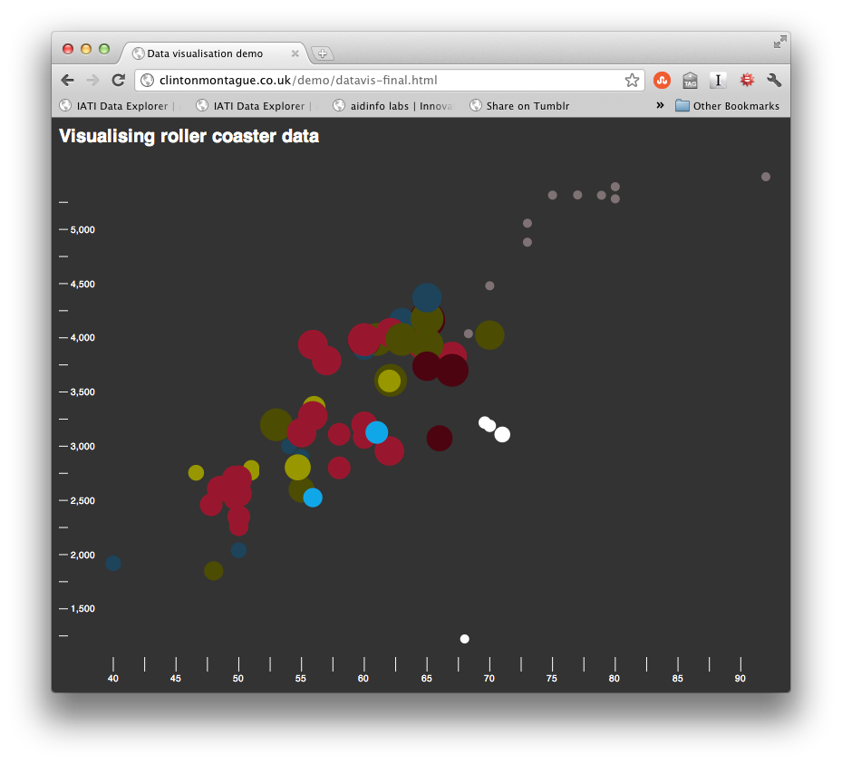
I have collected 8 datasets which contain a number of details about roller coasters and stored them in csv files. Each dataset represents one roller coaster manufacturing company. So each csv file contains a list of roller coasters built by an individual company. The roller coasters are split into further categories (or “types”) which are listed along with each roller coaster. Other interesting data in each row is the ride’s height, speed, length, duration, inversions (how many times it goes upside down), and the year that it opened. Some of this data is “dirty” which means it contains bad data values (for example, a length of zero feet).
The visualisation will:
- let you choose which dataset (company) you’d like to look at
- provide a list of checkboxes for each “type” of roller coaster which will let you drill down into a particular type you’d like to find out about (e.g. wooden coasters)
- change the colour of the datapoints to represent the different types (e.g. wooden is red, bobsled is blue)
- list out attributes which can go on the x and y axes, and to change the radius of the data points
- allow you to remove “dirty” data from the plot, leaving more room for the clean data
There is quite a lot more JavaScript than in the previous examples – this is because of the form controls. Everything which is needed to do the visualisation itself has already been covered, so don’t panic if it feels a bit overwhelming. I won’t go through every piece of JavaScript in the final demo (that would be another article in itself!), but I have commented it all so that hopefully it will make sense to you. If you’re struggling, I’d recommend reading up on arrays, and in particular, their iteration methods – you’ll find those very useful and they’ll need to be second nature if you are serious about data vis.
var WIDTH = 800, // width of the graph
HEIGHT = 550, // height of the graph
MARGINS = {top: 20, right: 20, bottom: 20, left: 60}, // margins around the graph
xRange = d3.scale.linear().range([MARGINS.left, WIDTH - MARGINS.right]), // x range function
yRange = d3.scale.linear().range([HEIGHT - MARGINS.top, MARGINS.bottom]), // y range function
rRange = d3.scale.linear().range([5, 20]), // radius range function - ensures the radius is between 5 and 20
colours = [ // array of colours for the data points. Each coaster type will have a differnet colour
"#981C30",
"#989415",
"#1E4559",
"#7F7274",
"#4C4A12",
"#ffffff",
"#4B0612",
"#1EAAE4",
"#AD5E71",
"#000000"
],
currentDataset, // name of the current data set. Used to track when the dataset changes
rawData, // the raw data from the CSV file
drawingData, // data with the coasters we don't want to display (dirty or it's "type" is unchecked)
xAxis = d3.svg.axis().scale(xRange).tickSize(16).tickSubdivide(true), // x axis function
yAxis = d3.svg.axis().scale(yRange).tickSize(10).orient("right").tickSubdivide(true), // y axis function
vis; // visualisation selection

// runs once when the visualisation loads
function init () {
vis = d3.select("#visualisation");

// add in the x axis
vis.append("svg:g") // container element
.attr("class", "x axis") // so we can style it with CSS
.attr("transform", "translate(0," + HEIGHT + ")") // move into position
.call(xAxis); // add to the visualisation

// add in the y axis
vis.append("svg:g") // container element
.attr("class", "y axis") // so we can style it with CSS
.call(yAxis); // add to the visualisation

// load data, process it and draw it
update ();
}

// this redraws the graph based on the data in the drawingData variable
function redraw () {
var rollercoasters = vis.selectAll ("circle").data(drawingData, function (d) { return d.id;}), // select the data points and set their data
axes = getAxes (); // object containing the axes we'd like to use (duration, inversions, etc.)

// add new points if they're needed
rollercoasters.enter()
.insert("svg:circle")
.attr("cx", function (d) { return xRange (d[axes.xAxis]); })
.attr("cy", function (d) { return yRange (d[axes.yAxis]); })
.style("opacity", 0)
.style("fill", function (d) { return colours[d.type.id]; }); // set fill colour from the colours array

// the data domains or desired axes might have changed, so update them all
xRange.domain([
d3.min(drawingData, function (d) { return +d[axes.xAxis]; }),
d3.max(drawingData, function (d) { return +d[axes.xAxis]; })
]);
yRange.domain([
d3.min(drawingData, function (d) { return +d[axes.yAxis]; }),
d3.max(drawingData, function (d) { return +d[axes.yAxis]; })
]);
rRange.domain([
d3.min(drawingData, function (d) { return +d[axes.radiusAxis]; }),
d3.max(drawingData, function (d) { return +d[axes.radiusAxis]; })
]);

// transition function for the axes
var t = vis.transition().duration(1500).ease("exp-in-out");
t.select(".x.axis").call(xAxis);
t.select(".y.axis").call(yAxis);

// transition the points
rollercoasters.transition().duration(1500).ease("exp-in-out")
.style("opacity", 1)
.style("fill", function (d) { return colours[d.type.id]; }) // set fill colour from the colours array
.attr("r", function(d) { return rRange (d[axes.radiusAxis]); })
.attr("cx", function (d) { return xRange (d[axes.xAxis]); })
.attr("cy", function (d) { return yRange (d[axes.yAxis]); });

// remove points if we don't need them anymore
rollercoasters.exit()
.transition().duration(1500).ease("exp-in-out")
.attr("cx", function (d) { return xRange (d[axes.xAxis]); })
.attr("cy", function (d) { return yRange (d[axes.yAxis]); })
.style("opacity", 0)
.attr("r", 0)
.remove();
}

// let's kick it all off!
init ();


//////////////////////////////////////////////////////////
// helper functions - health warning! LOTS of javascript!
//////////////////////////////////////////////////////////

// update the list of checkboxes which allows the selection of coaster types
function generateTypesList (data) {
var i = data.length,
typeNames = {},
select = document.getElementById("coaster-types"),
list = "";

// loop though each coaster and check it's type's name. If we haven't seen
// it before, add it to an object so that we can use it to build the list
while (i--) {
if (typeof typeNames[data[i].type.name] == "undefined") {
typeNames[data[i].type.name] = data[i].type.className;
}
}
// loop through the array to generate the list of types
for (var key in typeNames) {
if (typeNames.hasOwnProperty(key)) {
list += '<li class="' + typeNames[key] + '"><label><input type="checkbox" checked="checked" value="' + slugify(key) + '">' + key + '</label></li>';
}
}
// update the form
select.innerHTML = list;
}

// return the name of the dataset which is currently selected
function getChosenDataset () {
var select = document.getElementById("dataset");
return select.options[select.selectedIndex].value;
}

// take a string and turn it into a WordPress style slug
function slugify (string) {
return string.replace (/([^a-z0-9])/ig, '-').toLowerCase ();
}

// return an object containing the currently selected axis choices
function getAxes () {
var x = document.querySelector("#x-axis input:checked").value,
y = document.querySelector("#y-axis input:checked").value,
r = document.querySelector("#r-axis input:checked").value;
return {
xAxis: x,
yAxis: y,
radiusAxis: r
};
}

// after analysis, dirty data is considered to be that which can't be converted
// to a number, or where the number is 0 (meaning it is unknown)
function isDirty (data) {
var clean = "duration height opened speed length".split(" ").every (function (attribute) {
return !isNaN (+data[attribute]) && +data[attribute] > 0;
});
return !clean;
}

// return a list of types which are currently selected
function plottableTypes () {
var types = [].map.call (document.querySelectorAll ("#coaster-types input:checked"), function (checkbox) { return checkbox.value;} );
return types;
}

// take a raw dataset and remove coasters which shouldn't be displayed
// (i.e. if it is "dirty" or it's type isn't selected)
function processData (data) {
var processed = [],
cullDirty = document.getElementById("cull-dirty").checked,
coasterTypes = {},
counter = 1;

data.forEach (function (data, index) {
var coaster,
className = "";
if (!(cullDirty && isDirty(data))) { // don't process it if it's dirty and we want to cull dirty data
coaster = {
id: index // so that the coasters can animate
};
for (var attribute in data) {
if (data.hasOwnProperty (attribute)) {
coaster[attribute] = data[attribute]; // populate the coaster object
}
}
if (typeof coasterTypes[data.type] == "undefined") { // generate a classname for the coaster based on it's type (used for styling)
coasterTypes[data.type] = {
id: counter - 1,
className: 'coastertype-' + counter,
name: data.type,
slug: slugify(data.type)
};
counter = counter + 1;
}
coaster.type = coasterTypes[data.type];
processed.push (coaster); // add the coaster to the output
}
});

return processed; // only contains coasters we're interested in visualising
}

// remove coasters whose type is not selected from a dataset
function cullUnwantedTypes (coasters) {
var typesToDisplay = plottableTypes ();

return coasters.filter (function (coaster) {
return typesToDisplay.indexOf(coaster.type.slug) !== -1;
});
}

// called every time a form field has changed
function update () {
var dataset = getChosenDataset(), // filename of the chosen dataset csv
processedData; // the data while will be visualised
// if the dataset has changed from last time, load the new csv file
if (dataset != currentDataset) {
d3.csv("data/" + dataset + ".csv", function (data) {
// process new data and store it in the appropriate variables
rawData = data;
processedData = processData(data);
currentDataset = dataset;
generateTypesList(processedData);
drawingData = cullUnwantedTypes(processedData);
redraw();
});
} else {
// process data based on the form fields and store it in the appropriate variables
processedData = processData(rawData);
drawingData = cullUnwantedTypes(processedData);
redraw();
}
}

// listen to the form fields changing
document.getElementById("cull-dirty").addEventListener ("change", update, false);
document.getElementById("dataset").addEventListener ("change", update, false);
document.getElementById("controls").addEventListener ("click", update, false);
document.getElementById("controls").addEventListener ("keyup", update, false);
Have a play and see if you can find anything interesting! All of the files used in this tutorial are available for download if you fancy having a go at playing around with its guts.
I love this stuff! What next?
Good question.
What was it that you liked about reading this article? Was it the first part where we were playing with randomly generated data, or did you prefer taking real data, plotting it and finding interesting trends?
If you liked playing around with shapes, colours & animations, and the data was just a way to make things move, you should check out Processing which is very similar to d3 but is used to create digital and generative art and lets you compile your creations into applications. You can even hook it up to an Arduino and create interactive art.
If the data was more your thing, go out and grab yourself a dataset to play with! You can use my CSV files which are available in the demo files in the data directory if you’d prefer to dive straight in. Play around with different shapes and experiment with other ways to visualise the data: heatmaps, bar charts, on a map, you’re only limited by your imagination.
Whatever you choose to do, I hope that this has either helped you get to grips with d3, inspired you to play with data, sparked an interest in making animations in the browser or simply kept you interested enough while reading it. If you make anything interesting, I’d love to hear about it! Tweet me – @iblamefish.
Go forth and make cool stuff.