
Responsive Web Design gets a hammering within the performance field for producing heavy sites – with images usually taking the brunt of the blame. mDot sites are always believed to be more focused and lightweight and, whilst that is often the case, part of the reason for this perception is that many desktop sites are overly bloated to begin with.
As an industry we’re pretty good at tackling these challenges and the discussions around responsive image and High DPI image solutions rage on towards a hopeful conclusion. These solutions alone won’t automatically solve the original problem of image-rich sites though.
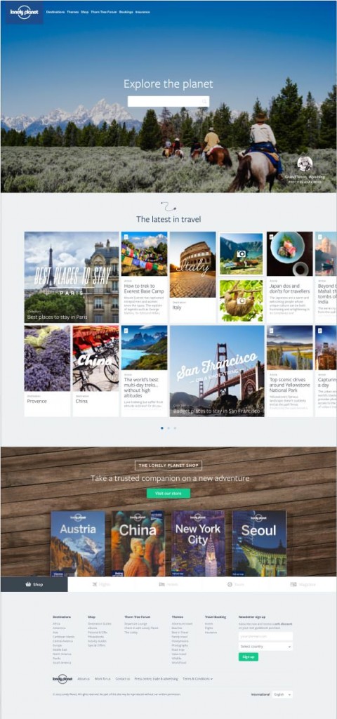
When I got the design for the recent iteration of the Lonely Planet homepage I was initially skeptical of how we could make it performant given the abundance of high resolution images. Almost all of the performance problems we faced stemmed from the amount, and the size, of the images we had to serve and there was no simple answer for how to offload them. Below is a comparison of the site before and after we optimised it:
| Start Render | Visually Complete | Fully Loaded | Bytes In | |
| Before | 1.151s | 15.700s | 18.512s | 3,160 KB |
| After | 0.812s | 3.600s | 5.564s | 674 KB |
Optimisation Process
We started with some best practices. These took us quite a long way there and will work for every single site. Then we had to work out what we could load on demand for the user and how we could anticipate their actions. The techniques that worked for us may not work for your site but the broader concept of taking a step back and searching for possible optimisations is something which certainly will.
1. Optimise all the image assets.
Before we began optimising the images with tooling we started back in Photoshop, tweaking compression rates and image dimensions to find the best combination (or combinations). Some images required multiple variations dependant on viewport size.
Then we ran all our images through optimisation tools. For JPEGs that meant JPEGMini – a paid for, but fantastic, app. ImageOptim works for both JPEGs and PNGs, though for JPEGs I generally find better results with JPEGMini. ImageAlpha is a tool for losslessly optimising PNG files which is also worth using.
I would always advise running your images through all three – and luckily there are plugins that have been built to do this for you: ImageOptim-CLI & grunt-imageoptim.
Optimising SVG is also worthwhile as they’ll often be output with additional meta data. SVGO or grunt-svgmin can help you with this.
It’s also worth mentioning at this point that there may be solutions for you outside of these traditional approaches, by using new image formats: WebP and Jpeg-XR. These are not simple to set up as you will require a server side solution to handle the content negotiation (not all browsers accept them), but there are significant gains to be made particularly on large images.
2. Define which images are critical to the page.
Once we have optimised the images there is very little else we can do without resorting to other loading techniques (read: Javascript). This will remain true until Resource Priorities become a legitimate standard.
If we’re going to load images with Javascript we need to work out which images are critical and which we will therefore include directly in the html. For this page, the critical images were the Logo and the Navigation Icon. If the Javascript breaks, or the user has turned it off, we still want these critical images to load; if the user consumes the page via a different medium (eg. Pocket) we still want them to be referenced within the page.
Once we’ve worked out which are critical, we need to take all the other images off the page. There are a few ways to do this: many of the current Responsive Image polyfills send an image with an empty src attribute and include the actual src in a data attribute. For what it’s worth, we wrapped them in good old fashioned html comments but if I were to do it again I would use the data-src approach as it gives you an element to bind events to.
Of course, this only works for foreground images. What about background images? In order to remove those from the initial load we defined a css selector which we applied to all elements with background images. Once we wanted to load it we simply removed the class from the element.
.image-blocker { background-image: none !important }
So now we have a really fast page albeit with no images. If I had my way we’d have shipped it and left for the day; instead we need to determine when to load them on demand for the user.
3. Lazyload the images
What we want to achieve here is to load the smallest amount of images up front, but not make the fact that we are doing this obvious to the user. If their experience is lessened by seeing loads of images loading later on in the page, then this technique has to some extent failed.
This section stops being about building websites and about building your site. Anything you can do to reduce the initial payload on the user will be appreciated by them, but it might just be that everything is immediately visible at which point there is little you can do. For our page, we thought there was plenty we could do. The three tiered design to the page also handily split our loading techniques.
1st Section – The Hero Image
With this section, you could argue the background image is critical to the page as the user sees it initially. The reason I didn’t include it in the page is because I wanted to be able to offer a lightweight experience for users on basic phones, piggybacking off the BBC News’ Cut the Mustard approach.
Once we determined the user had a decent browser (which didn’t include IE7 – an immediate win for the technique) a script at the bottom of the page loaded the background image.
2nd Section – The grid of Cards
What we have in this section is a horizontally-scrollable grid of cards. It contains around 40 cards and at the largest viewport we only display around 10 to the user. This is a perfect example of where we should be lazy loading images only once the user has shown an intent to view them.
If the user loads the page with a viewport width smaller than 1025px they get a simple scrollable pane that works with just the css overflow property.
The tactic we employed here is to initially load 1025px worth of cards. If their viewport lies between 67%-100% of 1025px then we will use that in the calculation and multiply it by 1.5, creating a buffer of cards loaded outside the viewport. Once the user begins scrolling we trigger the event to load all the other cards. By creating the buffer we hope to eliminate the user seeing the card images loading.
If the user loads the page on a wide screen (wider than 1025px for us) we instead use a Javascript component to paginate through the cards. There is no longer a scroll event to bind to as pagination is handled via buttons. This makes it trickier to load a buffer of cards.
We could have loaded the images on both of the first two pages on load, but what if they never paginate? Then we have just loaded an extra 12 images pointlessly.
We ended up agreeing that we will only load the first page. We load the remaining images once the user has hovered over the pagination buttons. We knew this would fail for wide-screen touch devices so we also triggered it on touch – though this technique would guarantee the user would still see images loading (a drawback we had to accept, although I’m sure there’s a nice solution out there).
3rd Section – The Tabs
What you can’t see is that unfortunately there’s a full background image on each of the five tab panels. If we chose to not lazyload these we would be doing a massive disservice to the user. They’re unlikely to scroll down that far anyway and even more unlikely to page through the tabs. We should only load them if we think there’s a chance they will do.
Of course with these tabs a better solution would have been to just remove them, though this was a product decision we couldn’t make.
So how to defer the load here? We could have gone down the same route as with the cards and loaded them when the user actually begins to interact with them. The only reason we avoided this was because we felt that they were already far enough down the page we could just load them based on the user’s scroll position. Once the user has scrolled to within 200px of the top of the tabs container then the images begin to load.
We use this same proximity technique for social widgets at the bottom of all our articles, only loading them once we know the user is approaching them.
That sounds like a lot of hard work.
It’s really not though. Your easiest solution is to push back on the design but, if you’re not in a position to do that, you should be thinking of other ways you can reduce the user’s bandwidth bill.
We only needed three technical elements to make this work: a helper to output deferred images (e.g. data-src), a Javascript module which detects the user’s viewport in relation to other elements (This is roughly how we do it), and another Javascript module which is capable of actually loading the foreground and background images.
All that is left is to figure out new and clever ways to anticipate the user’s actions and load assets for them on demand.